Dials and hands
Dials and hands |
|
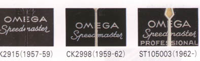
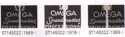
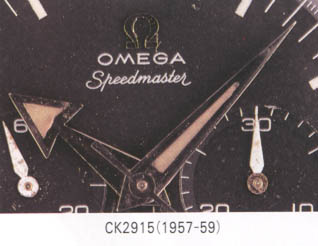
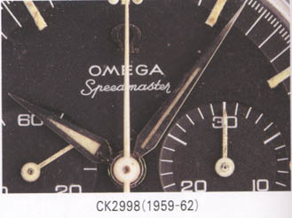
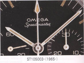
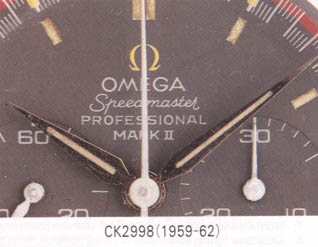
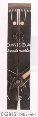
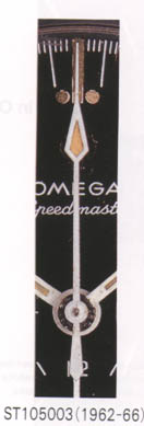
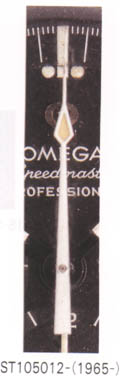
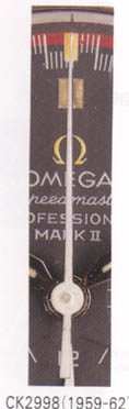
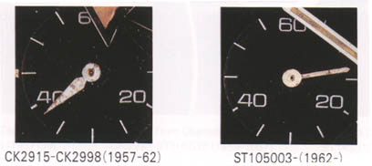
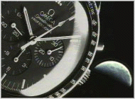
The Omega
Speedmaster (Professional) went through a lot of little changes. The most detailed changes
are probably those on the dial and hands. Below you can see a few photographs of the
Speedmaster dial through the years. The recently released 1957 Re-edtion of the
Speedmaster also have the big hands like the CK2915. You can see this one at the
photoalbum on my website.
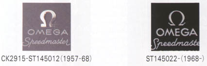
The most famous change on the dial is maybe the
Omega logo. From 1957 till 1968 Omega used the metal applied Omega logo on the dial.Most
people still like the metal applied logo more then the white marked. The metal applied
logo was probably changed into white because of the cost. Omega was the only brand back
then using metal for their logo on the dial.
|
||||||||||||||||||
|